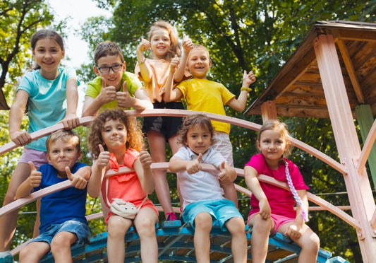


The Power of Color: Choosing the Right Palette for Playground Design
Jennie HallWhen it comes to playground design, color choice is more than just an aesthetic decision; it's a powerful tool that can influence the mood, behavior, and development of children. An effective color palette can transform a playground into a vibrant, welcoming, and stimulating environment that encourages exploration and play. Here are some key considerations for selecting the right colors for your playground design. Take a look and then contact our design team at info@goplaytopia.com to discuss your new design.
Understanding Color Psychology
Colors have a significant impact on emotions and behavior. Here’s a quick overview of how different colors can affect children:
- Red: This bold color can stimulate energy and excitement. It's great for creating dynamic spaces but should be used sparingly to avoid overstimulation.
- Yellow: Associated with happiness and creativity, yellow can make areas feel bright and cheerful. It's perfect for accenting play areas and drawing attention to specific features.
- Blue: Known for its calming effects, blue can help create a serene environment. It’s ideal for areas where you want to promote relaxation and focus.
- Green: Representing nature and tranquility, green is soothing and encourages a sense of peace. It’s an excellent choice for integrating natural elements and calming spaces.
- Orange: This color is warm and inviting, promoting enthusiasm and social interaction. It’s a great choice for communal play areas.
- Purple: Often linked to imagination and creativity, purple can inspire wonder and is perfect for areas dedicated to artistic activities.

Age-Appropriate Color Choices
Different age groups respond to colors in various ways. Younger children are attracted to bright, primary colors, while older children might prefer more subdued or sophisticated hues. When designing a playground, consider the target age group:
- Toddlers (0-3 years): Bright, contrasting colors like red, yellow, and blue can help stimulate visual development and keep toddlers engaged.
- Preschoolers (3-5 years): A mix of bright and pastel colors can be appealing. Incorporate a variety of hues to maintain interest and support their growing curiosity.
- School-Age Children (5-12 years): More complex color schemes with a blend of bright and muted tones can appeal to older children. Consider incorporating colors that reflect natural elements and themes. You can also consider school mascots or colors in your design brainstorming!

Thematic and Contextual Considerations
The theme of the playground can guide your color choices. For example:
- Nature-Themed Playgrounds: Earthy tones like greens, browns, and blues can help create a harmonious and immersive natural environment.
- Urban Playgrounds: Bright, bold colors can create a lively and modern feel, making the playground stand out in an urban setting.
- Fantasy or Adventure Themes: Use imaginative color combinations, including purples, pinks, and metallics, to evoke a sense of wonder and excitement.
We would love to design a unique playground for your space!
Inclusivity and Accessibility
Color choice can also enhance the inclusivity and accessibility of a playground. Ensure that your design is considerate of children with visual impairments or color blindness. High-contrast color schemes can help these children navigate the space more easily. Additionally, incorporating textured surfaces alongside color can provide sensory feedback for children with different needs. Playtopia designers have years of experience designing playgrounds to be inclusive and fun for all children.
Safety and Maintenance
Practical considerations like safety and maintenance should also influence your color choices. Lighter colors may show dirt and wear more quickly, while darker colors can help mask these issues. Additionally, ensure that colors used on surfaces exposed to direct sunlight are UV-stable to prevent fading and maintain the playground’s vibrant appearance over time. Our colors are UV-stable!
Conclusion
Choosing the right colors for a playground is a multifaceted process that requires balancing aesthetics with functionality, psychology, and inclusivity. By understanding the effects of different colors and thoughtfully applying them to your design, you can create a playground that is not only visually appealing but also supportive of children’s developmental needs. Whether you’re designing a nature-inspired retreat or a bustling urban play space, the right color palette can make all the difference in creating a joyful and engaging environment for children to explore and enjoy. Playtopia would love to help you in this journey!